The original 1910 house on this New Farm, Tasmania site offered plenty of charm, but failed to embrace its generous garden and mountain views.
Recognising these simultaneous strengths and shortcomings, Preston Lane Architects designed a new extension to soak in the sun, capture the mountains, and feel immersed in the garden.
The new extension is larger, but not extensively so, and works with the property’s sloping site to incorporate a second entry, powder room, kitchen, dining, and living area. Unlike the previous lean-to that was elevated above ground, this new structure sits in the garden, appearing to be ‘hugged’ by established plants outside.
‘Condensing the footprint kept the garden intact – providing spaces for plants, cartwheels and their dog to explore,’ says Daniel Lane, director and architect at Preston Lane Architects.
On the side of the north-western face of the home is also an artist’s studio/guest bedroom, which opens to a courtyard and timber deck. ‘The clients had a strong desire for an ‘in between’ courtyard space that could be eventually overgrown,’ says Daniel of this outdoor area. ‘Sandstone and gravel provides a textural quality against the timber deck.’
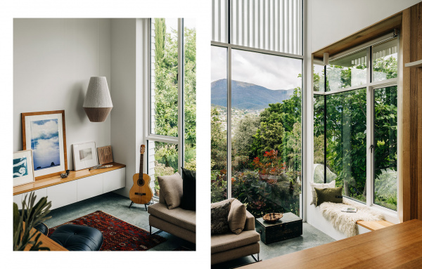
The interiors similarly accentuate the home’s aspect, along with its sloping site. Daniel explains, ‘The ceiling line rakes up towards the mountain vista increasing the volume internally before you step down again into a sunken living space.’
Every space has been offered a view of the sky, garden or mountain, but the best spot of all is the living room corner window seat. ‘In this sunny window spot you can sit and read a book or look up to the mountain,’ says Daniel. ‘You’re physically separated from the kitchen hub but can still be involved in conversations.’
The simple material palette allows the client’s artwork, objects and floral arrangements to be another focus.
Overall, Preston Lane Architects have transformed a disconnected, dark cottage into a generous, warm and welcoming family home. Nestled delicately in the established garden, the project achieves a private, calm oasis for the family of four to retreat, whilst remaining connected to nature.

Pirie Street Extension reclines back onto a hill in New Town, Tasmania, providing an outward focus to what was an internalised but charming 1910 cottage. Photo – Adam Gibson. Styling – Kate Moss – This Vacant Space

Preston Lane was engaged to design an extension to soak in the sun, capture the mountain and feel immersed in the garden. Photo – Adam Gibson. Styling – Kate Moss – This Vacant Space

Every space has been offered a view of the sky, garden or mountain, but the best spot of all is the living room corner window seat. Photo – Adam Gibson. Styling – Kate Moss – This Vacant Space

The simple material palette allows the client’s artwork, objects and floral arrangements to remain in focus. Internal paint colour Dulux Snowy Mountains Half. Photo – Adam Gibson. Styling – Kate Moss – This Vacant Space

An internal fireplace defines the living space and accentuates its volume. Internal paint colour Dulux Snowy Mountains Half. Photo – Adam Gibson. Styling – Kate Moss – This Vacant Space

Unlike the previous lean-to that was elevated above ground, this new structure sits in the garden, appearing to be ‘hugged’ by established plants outside. Photo – Adam Gibson. Styling – Kate Moss – This Vacant Space

The project focused on clean lines and alignment. Kitchen cupboards are Laminex AbsoluteMatte in white. Internal paint colour Dulux Snowy Mountains Half. Photo – Adam Gibson. Styling – Kate Moss – This Vacant Space

Kitchen cupboards are Laminex AbsoluteMatte in white. Photo – Adam Gibson. Styling – Kate Moss – This Vacant Space

The ceiling line rakes up towards the mountain vista, increasing the volume internally, before stepping down again into a sunken living space. Photos – Adam Gibson. Styling – Kate Moss – This Vacant Space

Specific to the client’s brief was an artist studio with garden views. Paintings by the home owner. Internal paint colour Dulux Snowy Mountains Half. Photo – Adam Gibson. Styling – Kate Moss – This Vacant Space

The studio opens to a courtyard and timber deck. Photo – Adam Gibson. Styling – Kate Moss – This Vacant Space

The building form is clipped and white – a crisp contrast to the soft textural garden of which it sits. Photo – Adam Gibson. Styling – Kate Moss – This Vacant Space

The outdoor entertaining area. Photo – Adam Gibson. Styling – Kate Moss – This Vacant Space

Close proximity to the garden with its magnolia, pear, and apricot trees invites and dappled shadow play into the interiors throughout the day. Photo – Adam Gibson. Styling – Kate Moss – This Vacant Space


