Flow can be a fickle beast when renovating heritage houses. Freeing up extra space, while also retaining the rhythms of the original home don’t always come hand in hand; so subtle transition spaces prove essential to providing continuity.
When nutting out how to connect the intact Victorian front with their plans for a breezy, contemporary renovation at the rear of this house in Williamstown, ioa Studio settled on light, in-built joinery to complete the task. A long wall of ceiling-high bookshelves eases the progression between old and new zones; connecting the living and dining room to the kitchen, as well as concealing ancillary spaces behind it.
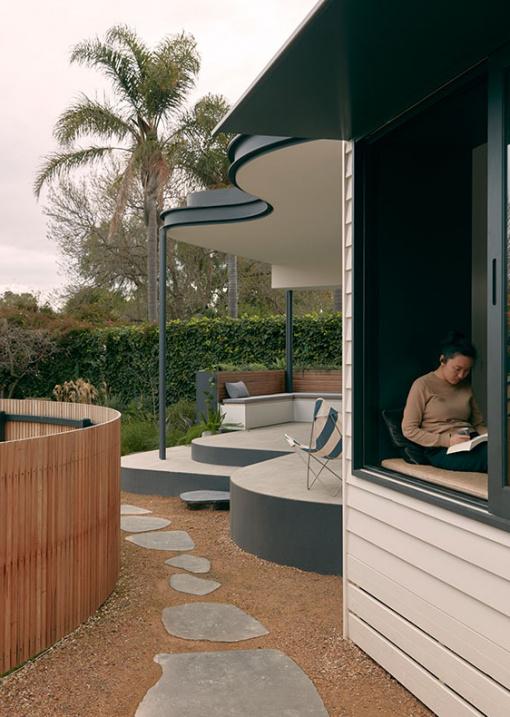
At points throughout the open plan space, pockets of custom joinery are accompanied by glazing to create reading nooks and window outlooks to the pool, terrace and ivy-covered fenceline.
‘Before the renovation, the back portions of house had a lot of wasted space and the rooms were badly oriented,’ says architect, Amy Bracks. ‘With the design, we were able to reverse this, using each part of the space and floor area to its advantage.’ A steel framed glass door now marks the threshold of the renovation, segmenting the modern, open-plan area from its revitalised heritage counterpart.
ioa Studio had very tight heritage controls to contend with when devising their designs, leading them to work within the original footprint and innovate with materials. A curved steel awning shields the terrace, while silver top ash battens clad the shed and pool fence. Meanwhile, American oak floorboards and stone benchtops comprise a lean, hard-wearing palette inside.
In collaboration with their builder, BFC Built, the architects ensured that nearly all the materials from the interior demolition were re-homed for future projects – including the huge granite benchtops from the former kitchen, which were sent to a new site the architects are developing in Swan Hill.
Despite the architects’ precise configurations and subtle design manoeuvres, there was still room for some elements of surprise in this home. Secreted in the living room shelves is a hidden doorway leading to a private nook, which contains a study, bathroom and stairs to the wine cellar!
See more projects from ioa Studio here.

Though working inside the footprint of the original house, the rear half was gutted and the layout completely reorganised. Photo – Tom Ross.

Timber was the chosen material for the transition spaces, easing the flow between old and new zones of the house. Photo – Tom Ross.

Light custom joinery marries seamlessly with the recycled oak floorboards. Photo – Tom Ross.

Pockets of joinery are placed throughout to create moments like this heavenly reading nook. Photo – Tom Ross.

Sage green tiles offer a pop of colour in the kitchen. Photo – Tom Ross.

As well as their aesthetic purpose in unifying the disparate energies of the house, the shelves display the owner’s collection of art, books and objects. ‘These personal items become part of the materiality of the house,’ notes Amy. Photo – Tom Ross.

A cupboard door is actually a a hallway, leading to a study, bathroom and staircase to the wine cellar!Photo – Tom Ross.

The hidden study is darker in tone; deep blues and forest green create a contemplative mood – a touch courtesy of interiors whiz Lisa Keddie at InDesign Company! Photo – Tom Ross.

And contains its own reading nook! Photo – Tom Ross.

A large steel framed glass door separates the restored heritage front from the new, open-plan renovation at the rear. Photo – Tom Ross.

Light and curves at play in the bathroom. Photo – Tom Ross.

Light bounces off the cool blue tones in the bathroom. Photo – Tom Ross.

A curved steel awning shields the terrace from the sun, mirroring the shape of the undulating pool fence made from silver ash timber battens. Photo – Tom Ross.

Connecting the spacious, brightened living space to the garden was a central design objective. Photo – Tom Ross.


