It’s not immediately evident when this Victorian seaside home was built, which is a testament to its timeless design.
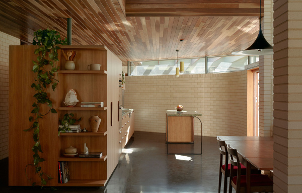
Drawing on a materials palette popularised by modernist architects including Harry Seidler and Richard Neutra, there’s certainly a mid-century quality to the design, but one that’s entirely suited to its coastal environment, and contemporary family life.
The house was designed and documented at Nest Architects and continued through the construction stage by Placement. Their practical vision was to create a family home that could grow and shrink as required.
‘At the time the three kids were at an age where they would be living at home, but in the next few years they would soon finish high school and subsequently leave the nest. The home needed to be adaptable for the coming future, where most bedrooms would be empty for most of the year,’ explains Stephanie Kitingan, director and architect at Placement.
This intent fed into how the plan was resolved, culminating in a bedroom wing that could be blocked off for privacy, or rented out in future as accommodation.
From an architectural perspective, the house plays with mass to frame views and recreate the privacy of the client’s previous home. ‘There seem to be two masses – the base and the roof – broken up by a continuous expanse of glazing. It provides a delicate expression to the otherwise heavy tectonics of the house,’ says Stephanie.
White brick provides further lightness to the solid masonry, while spotted gum timber emits a sense of warmth. The external fascia colour was originally specified to match the brick, however as the project neared completion, the clients had a strong desire for a green fascia (Dulux Deep Reed). This colour ties in perfectly with the thriving garden by Akas Landscape Architecture.
Interior spaces are open, but contain several built-in seating areas to offer a sense of refuge.
This is a forever home – a place the owners can grow old in, and enjoy time close to friends, family, and of course, the beach!

The modernist-inspired home is cushioned by surrounding greenery. Photo – Tom Ross. Editorial styling – Tom Ross, Stephanie Kitingan and Patrick Hegarty.

The family of five were seeking a feeling of lightness and stillness in their new environment, without losing the privacy they’d become accustomed to. Photo – Tom Ross. Editorial styling – Tom Ross, Stephanie Kitingan and Patrick Hegarty.

Drawing on the material palette popularised by modernist architects including Harry Seidler and Richard Neutra, there’s certainly a mid-century quality to the design. Photo – Tom Ross. Editorial styling – Tom Ross, Stephanie Kitingan and Patrick Hegarty.

The new mid-century inspired home is suited to its coastal environment and contemporary family owners. Photo – Tom Ross. Editorial styling – Tom Ross, Stephanie Kitingan and Patrick Hegarty.

The perfect nook. Photo – Tom Ross. Editorial styling – Tom Ross, Stephanie Kitingan and Patrick Hegarty.

Different colours signify transition between new zones. Photo – Tom Ross. Editorial styling – Tom Ross, Stephanie Kitingan and Patrick Hegarty.

From an architectural perspective, the house plays with mass to frame views and recreate the privacy of the client’s previous home. Photo – Tom Ross. Editorial styling – Tom Ross, Stephanie Kitingan and Patrick Hegarty.

‘There seem to be two masses – the base and the roof – broken up by a continuous expanse of glazing. It provides a delicate expression to the otherwise heavy tectonics of the house,’ says director and architect at Placement, Stephanie Kitingan. Photo – Tom Ross. Editorial styling – Tom Ross, Stephanie Kitingan and Patrick Hegarty.

Incorporated shelving showcases the family’s treasures. Photo – Tom Ross. Editorial styling – Tom Ross, Stephanie Kitingan and Patrick Hegarty.

White brick provides further lightness to the solid masonry, while spotted gum timber emits a sense of warmth. Photo – Tom Ross. Editorial styling – Tom Ross, Stephanie Kitingan and Patrick Hegarty.

Interior spaces are open, but contain several built-in seating areas to offer a sense of refuge. Photo – Tom Ross. Editorial styling – Tom Ross, Stephanie Kitingan and Patrick Hegarty.

A view down the moody corridor. Photo – Tom Ross. Editorial styling – Tom Ross, Stephanie Kitingan and Patrick Hegarty.

The bedroom wing can be blocked off for privacy, or rented out in future as accommodation. Photo – Tom Ross. Editorial styling – Tom Ross, Stephanie Kitingan and Patrick Hegarty.

In-build storage and desk space is built into the length of the corridor. Photo – Tom Ross. Editorial styling – Tom Ross, Stephanie Kitingan and Patrick Hegarty.

Cracks of sunlight filter through the bathroom. Photo – Tom Ross. Editorial styling – Tom Ross, Stephanie Kitingan and Patrick Hegarty.

Pops of muted colour play with the timber surfaces of the bathroom cabinetry. Photo – Tom Ross. Editorial styling – Tom Ross, Stephanie Kitingan and Patrick Hegarty.

The landscaping was completed by Akas Landscape Architecture. Photo – Tom Ross. Editorial styling – Tom Ross, Stephanie Kitingan and Patrick Hegarty.

The external fascia colour was originally specified to match the brick, however as the project neared completion, the clients had a strong desire for a green fascia (Dulux Deep Reed). Photo – Tom Ross. Editorial styling – Tom Ross, Stephanie Kitingan and Patrick Hegarty.

It’s not immediately evident when this Victorian seaside home was built, which is a testament to its timeless design. Photo – Tom Ross. Editorial styling – Tom Ross, Stephanie Kitingan and Patrick Hegarty.


