The Green House by Circle Studio Architects has a south-facing rear – the most challenging aspect to grapple with when designing a new architectural project.
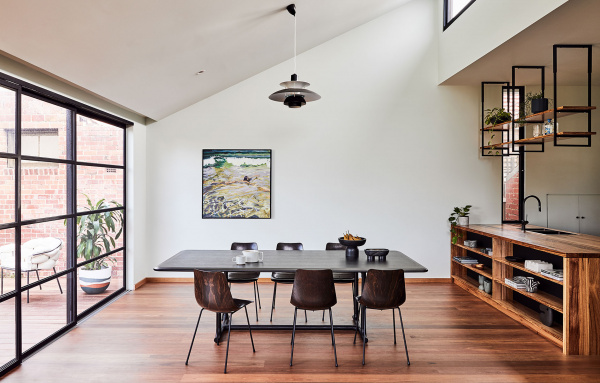
In order to overcome this challenge of limited natural light into the back of the home, the architects designed the extension frame with a sloping roof, fitted with clerestory windows on the northern side. Natural light now filters in through three of the four sides.
After resolving the natural light issue, attention was turned to the internal configuration. Three original bedrooms at the front of the house were retained, with a new laundry tucked into the hallway behind cabinetry to create a fluid entry passage. The former 80s style kitchen marked the beginning of the open-plan extension, and was replaced with a warm palette of chestnut timber and black fixtures.
‘Because the kitchen space is so compact, unenclosed shelving was used to keep the space looking open,’ explain architects, Amber Laing and Yvonne Meng. In the adjacent living room, a window seat made from spotted gum timber is another clever space-saving element.
Whilst the interior of this home is sleek and minimal, the exterior offers an unexpected aesthetic flourish! Green tiles referencing the classic pubs of Melbourne’s northern suburbs wrap the extension form, while a generous curved timber deck creates continuation between the indoor and outdoor material expression.
‘Similar to how a mirrored box might react in the bush, vegetation is reflected on the rear and side facades with movement visible as the weather dictates,’ say Amber and Yvonne of the tile cladding. ‘The organic patterning this creates is fluid, and connects the extension into the landscape’
With a functional new floorplan and clever solutions to maximise natural light, this once cold, dark, south-facing weatherboard has been transformed into a warm, bright and eye-catching home!
See more projects from Circle Studio Architects here.

Green tiles referencing the pubs of Melbourne’s northern suburbs clad the outside of the project. Photo – Jade Cantwell. Stylist – Bea Lambos.

The tiles reflect glittering natural scenery back around on the garden. Furniture from DOMO Australia. Photo – Jade Cantwell. Stylist – Bea Lambos.

Clerestory windows were key to bringing northern light into the south-facing rear extension. Furniture from DOMO Australia. Painting by Jasmine Mansbridge. Photo – Jade Cantwell. Stylist – Bea Lambos.

The open plan extension consists of a living, dining and kitchen area with windows on three out of four sides flooding the space with natural light. Furniture from DOMO Australia. Painting by Marko Hrubyj-Piper from Studio Gallery Melbourne. Photo – Jade Cantwell. Stylist – Bea Lambos.

The warm kitchen is characterised by the soft chestnut cabinetry and black fixtures. Furniture from DOMO Australia. Photo – Jade Cantwell. Stylist – Bea Lambos.

A curved deck contrasts with the sharp roofline. Photo – Jade Cantwell. Stylist – Bea Lambos.


