The client brief for Norwood was fairly typical for an inner-city Melbourne Victorian terrace renovation. ‘Mainly they wanted to open up the living spaces to the backyard; increase the amount of natural light coming into the house; and create a welcoming space to entertain and cook for family and friends,’ says Architecture Architecture director Nick James.
Architecture Architecture agreed with the vision, although achieving this level of amenity on such a narrow block required a clever design response.
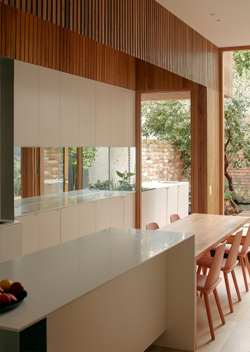
The solution – integrating custom, built-in furniture to activate the site’s edges. Upholstered banquettes, window seating, and kitchen benches now line the living space, freeing up the centre for a generous island bench and built-in table. ‘Everything feels integrated – is integrated – fitting together like a three-dimensional jigsaw,’ says Nick.
An opportunity to combine indoors and out was also identified, allowing the living area and rear courtyard to benefit from a sense of borrowed space. ‘We understood from the outset that designing the threshold was key, establishing continuity and generosity between these two zones and effectively unifying them,’ explains Nick.
The kitchen bench continues into the yard for outdoor cooking; a timbered awning draws back into the house filtering light from a skylight above; and an indoor seat extends to an outdoor platform for perching and sunbathing.
Further enhancing the sense of space are strategically placed mirrors in the living room to reflect light and garden snippets.
Once tight, shadowy and disconnected, this updated house is expansive, light-filled, and open. Major changes have been achieved without adding an extension or imposing on neighbours. Genius!

Norwood is a Victorian home renovation by Architecture Architecture. Photo – Tom Ross

The building footprint has barely changed, yet this house feels substantially larger. Photo – Tom Ross

The kitchen bench continues into the yard for outdoor cooking and food preparation, while a timbered awning draws back into the house. Photo – Tom Ross

Upholstered banquettes, window seating, and kitchen benches line the living space, freeing-up the centre for a generous island bench and built-in table. Photo – Tom Ross

The battened skylight over the kitchen introduces a soft, even light over the space. Photo – Tom Ross

Both the living space and rear courtyard benefit from a sense of borrowed space. Photo – Tom Ross

An indoor seat extends to an outdoor platform for perching and sunbathing. Photo – Tom Ross

Built in-seating around the dining area. Photo – Tom Ross

Once tight, shadowy and disconnected, this house is now expansive, light-filled, and open. Photo – Tom Ross

Major changes have been achieved without adding an extension, and without imposing on neighbours. Photo – Tom Ross


