An inside joke between the owners of this Sydney pad and their designer formed the interesting design concept at the heart of this renovation. Having spent his teenage years on the Central Coast, Matt Woods wanted to make a slick, beachy home for his clients that didn’t feel ‘unapproachable or pretentious’.
But it was on a long drive back to Sydney after his first visit to the Avoca Beach house that he decided to incorporate elements of Greek Mythology.
‘As with most of my ideas, it’s firmly tongue in cheek. The owners of the house are very good mates of mine, and while it’s too convoluted of a story to tell succinctly, the punch line is that the previous owner had lived in the house “for ages”…’ Matt says.
The comment stuck with him, and he decided to weave elements of the mythological story of the Four Ages into the family home’s renovation. The finished product boasts subtle design details such as new black-framed windows hint to the Iron Age. Meanwhile, chic stainless steel finishes and pops of colour allude to the Silver and Bronze ages, respectively.
But crisp white walls and wide windows ensure it’s still bright and relaxed – arguably, like all good coastal homes should be!
Unbelievably, the re-design of this previously dark, under-utilised home lies completely within its original footprint. Without extending the size of the home, Matt and his team re-configured the internal floor-plan to open up living spaces and remove a bedroom.
This is just the first instalment of a series of renovation works on the property. Future plans include the addition of two more bedrooms, the conversion of a garage into a home office, a gym, yoga room and more!
‘Form always follows function, and the house just wasn’t fit for purpose. We’ve rectified that now, and will keep on adding to it over the next little while,’ Matt explains.
See more works from Killing Matt Woods here.
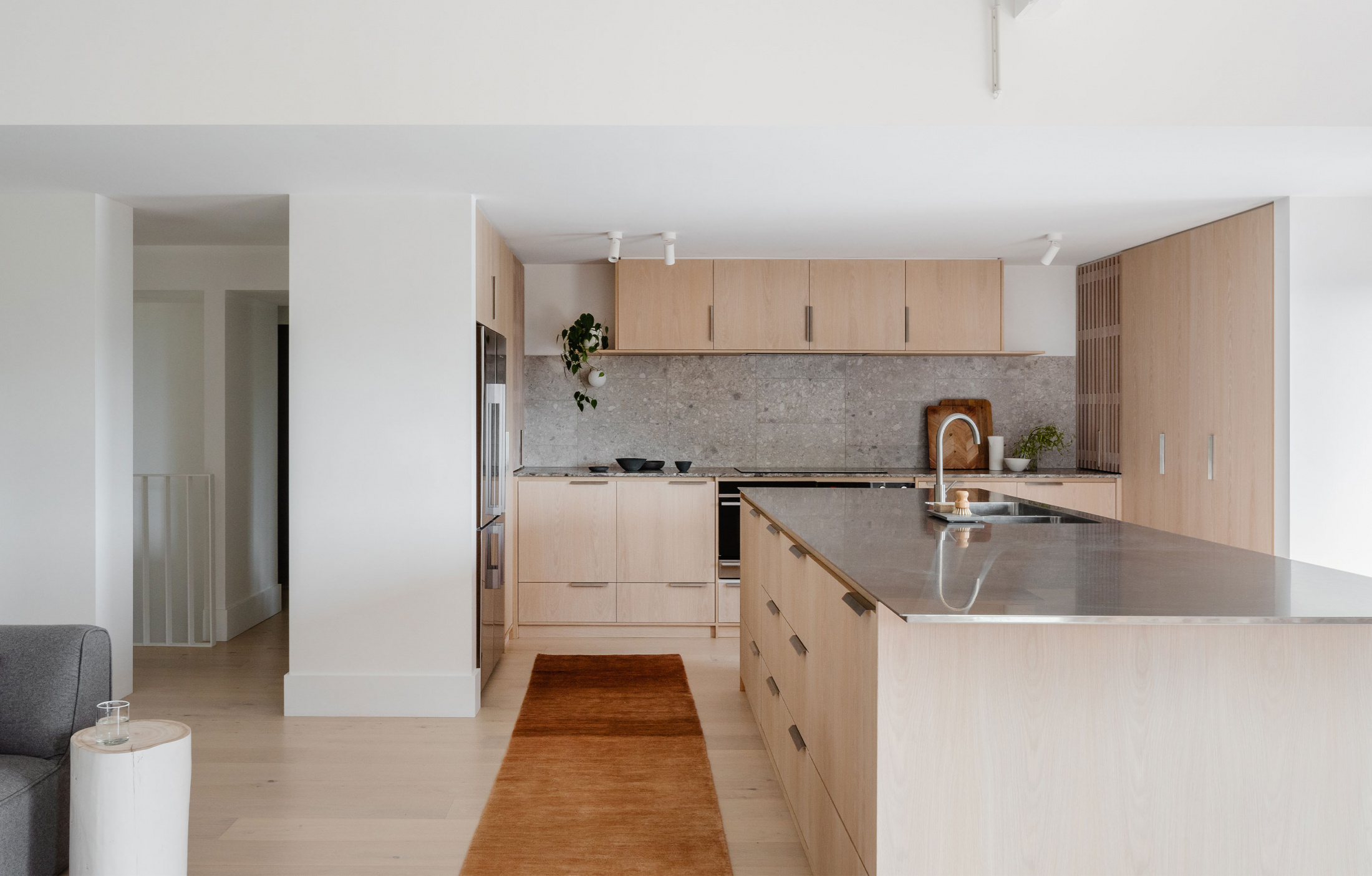
Inside the coastal home. Photo – Kat Lu. Styling – Madeline Mcfarlane
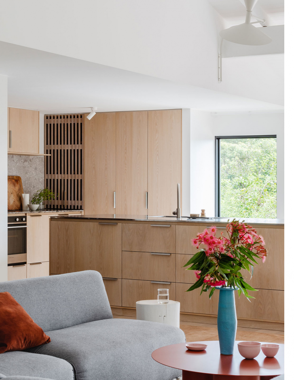
Matt says the Golden Age is referenced in the refreshed pad’s now light and bright aesthetic. Photo – Kat Lu. Styling – Madeline Mcfarlane
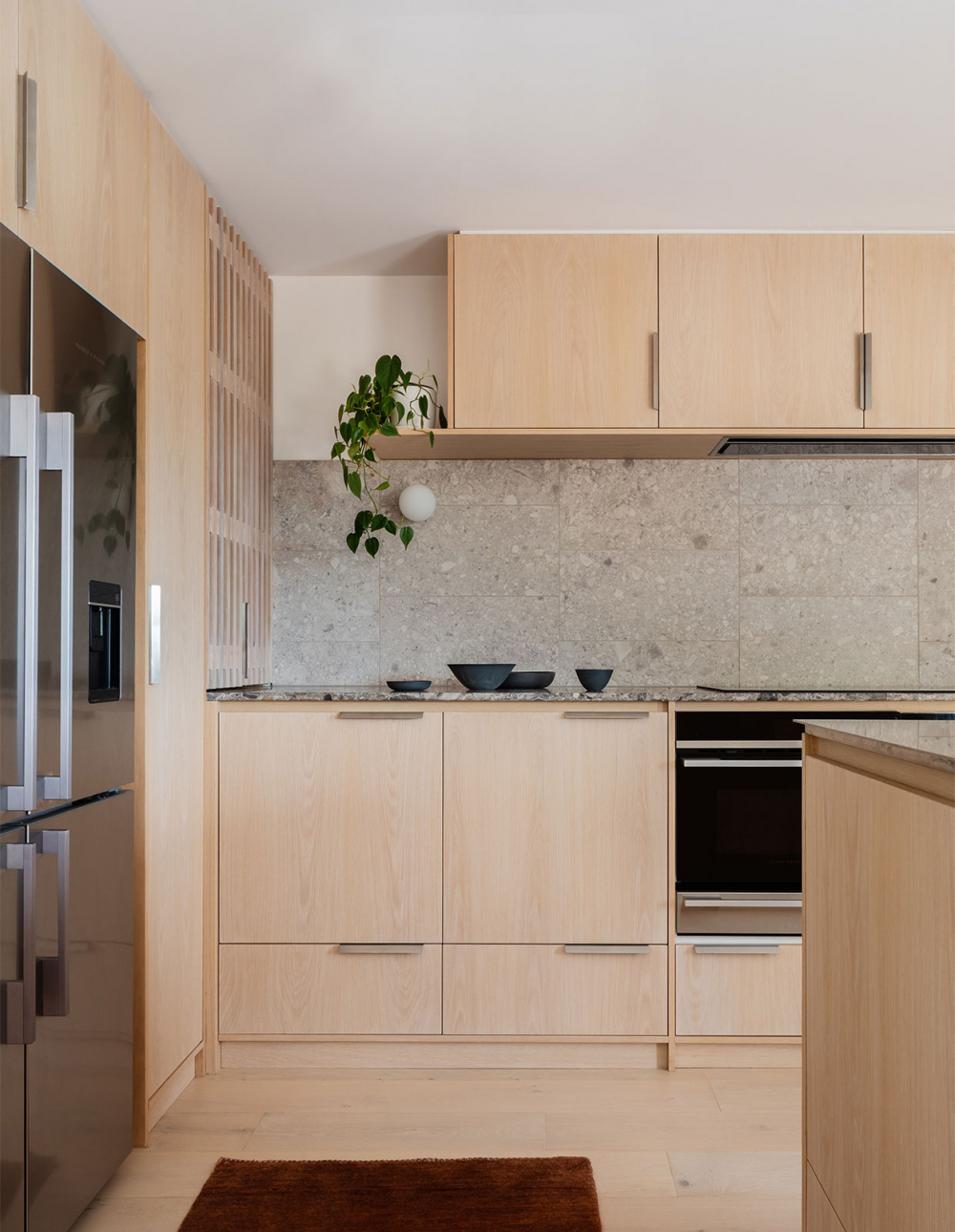
The old layout was ‘ineffective’ for the busy family of four. Photo – Kat Lu. Styling – Madeline Mcfarlane
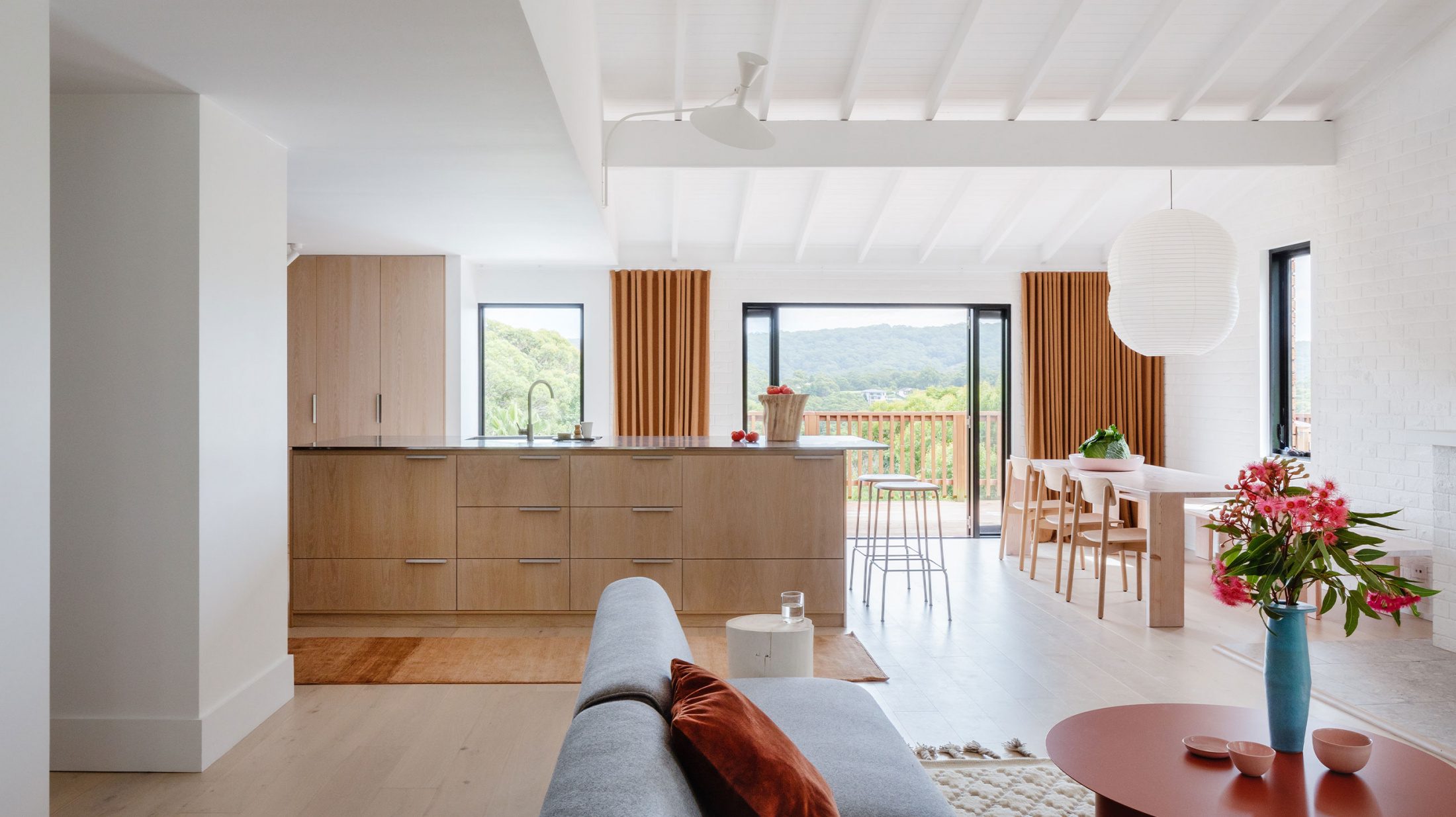
Spot the pops of copper tones as a hint to the Bronze Age. Photo – Kat Lu. Styling – Madeline Mcfarlane
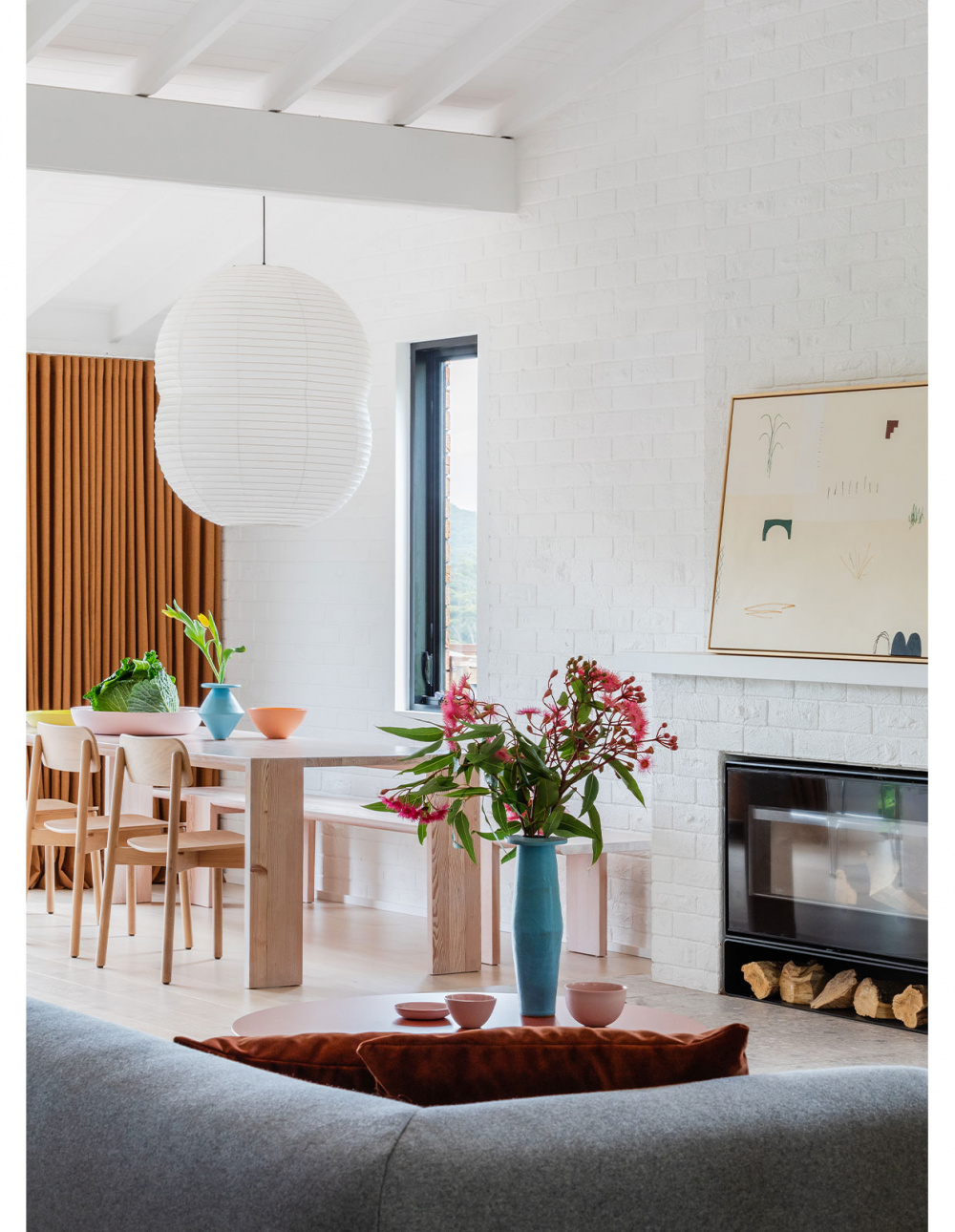
The project re-imagined the floor-plan for the family’s needs. Photo – Kat Lu. Styling – Madeline Mcfarlane
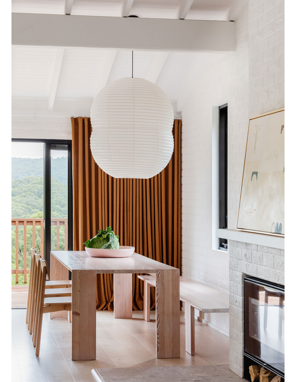
Lush views enhance the relaxed vibe inside. Photo – Kat Lu. Styling – Madeline Mcfarlane
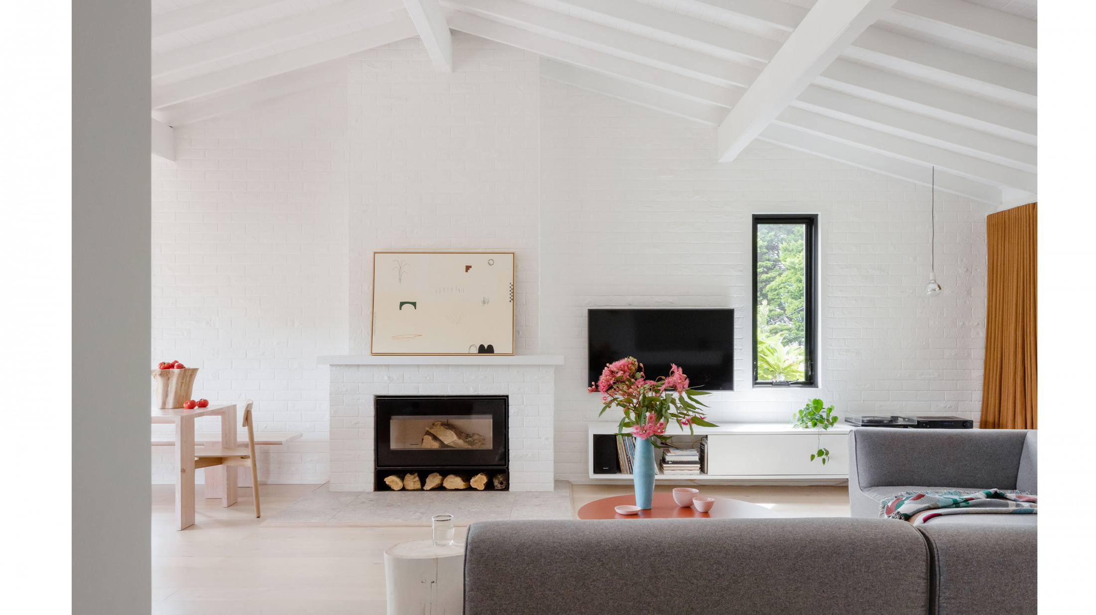
‘[It’s] all continuing within the existing footprint, however we fiddled with the internal layout, opening up the living spaces, relocating kitchen & bathrooms and we deleted a bedroom.’ Matt says. Photo – Kat Lu. Styling – Madeline Mcfarlane
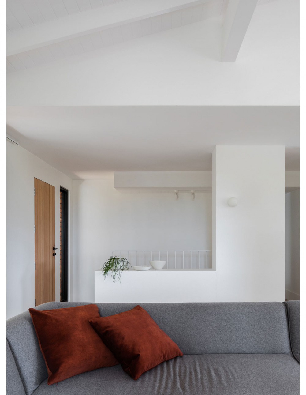
The new kitchen. Photo – Kat Lu. Styling – Madeline Mcfarlane
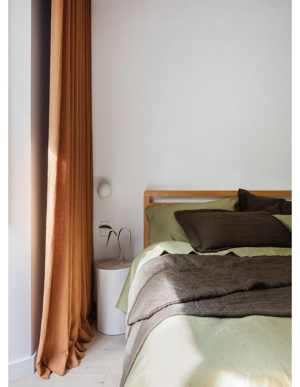
Ensuring natural light could flow through the home was central to the redesign. Photo – Kat Lu. Styling – Madeline Mcfarlane
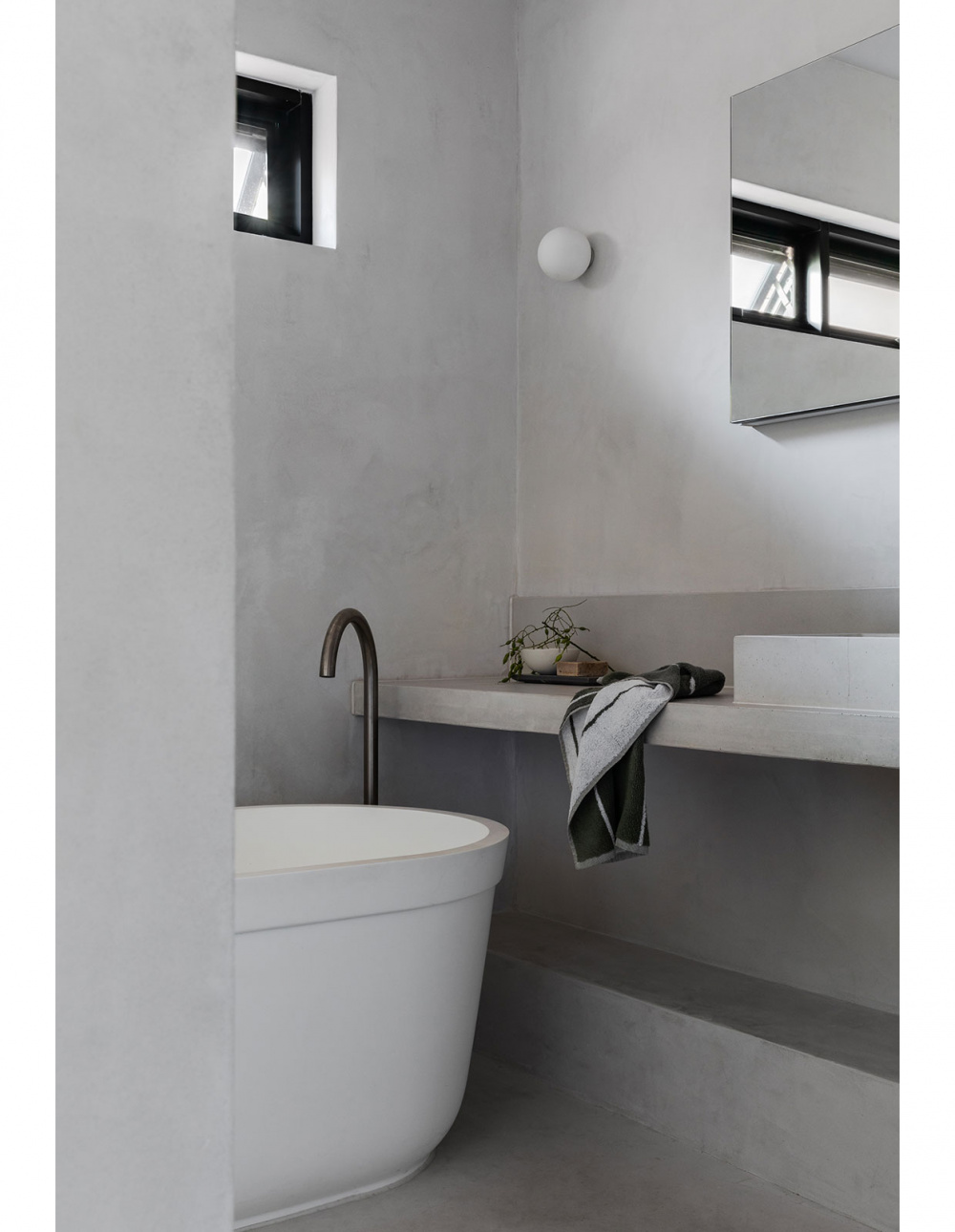
Matt highlights the main bathroom as a standout feature, saying ‘it’s slightly moodier that the rest of the home.’
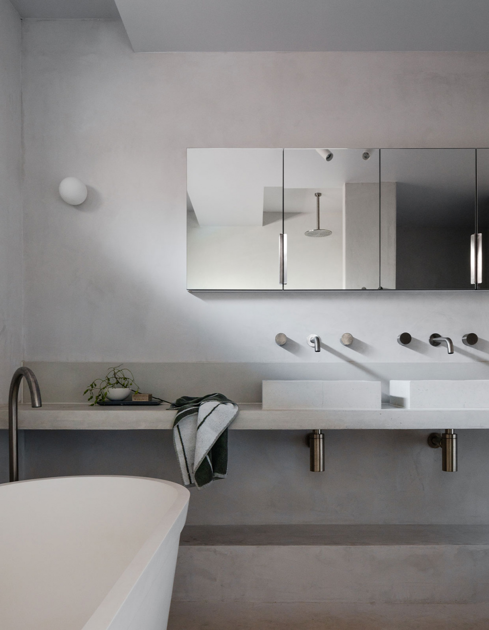
‘[It] is a minimal and restrained space, and adds a weightiness to the white on white scheme used elsewhere,’ Matt says.


