Architect Nic Brunsdon poetically yet accurately describes this East Fremantle home when he says, ‘The most important part of this house is the space that is not built – specifically, a large northern void.’
This new ‘garden room’ is lined with sliding north-facing doors, allowing the space to cleverly spill outdoors and occupy the full width of the site. The remainder of the home’s interiors trace this outdoor space’s edge, facilitating rooms with an immediate connection to the natural elements. ‘The building then becomes secondary and deferential to this,’ Nic says.
Previously a dark period home with ‘60s additions and asbestos sheds at the rear, the home is now arranged as four interconnected sections: the existing brick cottage, an entry link, a ground floor addition, and first floor addition.
‘The entry link acts as a mediating point – the connective tissue between the elements – dark, hard and solemn,’ says Nic.
A new ‘front’ entry point on the property’s south has been established between this element and the restored cottage. On the opposite side is then the central garden room, with a new wooden box perched on top containing the master bedroom.
New sections of the homes are distinguished by a contrasting material palette, ranging from masonry construction in the ground floor addition, and light-framed natural timbers above.
There were many challenges along the way (the original builder going out of business halfway through the project among them; then a hand grenade being found buried in the backyard!) but this successfully completed project shows the power of bringing the outdoors in.
Nic says, ‘The garden – this void of space – gives measurable and appreciable amenity to the project and shows that an understanding of and connection to our celestial sphere can shape the rhythms, patterns, and quality of daily family life.’

The East Fremantle house by Nic Brunsdon is a an extended period home that traces a new north-facing outdoor space. Photo – Dion Robeson. Styling – Janet Keating and Amy Collins Walker

The new upper-storey extension is a light and articulated timber box. Photo – Dion Robeson. Styling – Janet Keating and Amy Collins Walker

‘The most important part of this house is the space that is not built – specifically, a large northern void,’ says Nic. Photo – Dion Robeson. Styling – Janet Keating and Amy Collins Walker

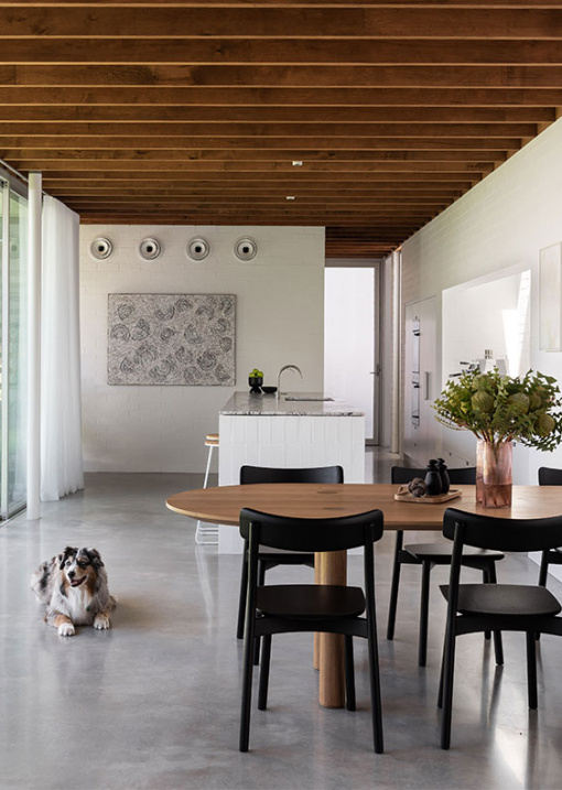
The ‘garden room’ containing the main living areas is lined with sliding north-facing doors, allowing the space to cleverly spill outdoors and occupy the full width of the site. Artwork by Jordy Hewitt. Photo – Dion Robeson. Styling – Janet Keating and Amy Collins Walker

Previously a dark period home with ‘60s additions and asbestos sheds at the rear, this home is now arranged as four interconnected sections: the existing brick cottage, an entry link, a ground floor addition, and first floor addition. Photo – Dion Robeson. Styling – Janet Keating and Amy Collins Walker

New sections of the homes are distinguished by their varied material palette, ranging from masonry construction in the ground floor addition, and light-framed natural timbers above. Artwork by Jordy Hewitt. Photo – Dion Robeson. Styling – Janet Keating and Amy Collins Walker

The ground floor addition is masonry construction, either painted or bagged brick, or rough thrown concrete, all painted white. Artwork by Jordy Hewitt.Photo – Dion Robeson. Styling – Janet Keating and Amy Collins Walker

The sunken lounge room. Artwork by Jordy Hewitt. Photo – Dion Robeson. Styling – Janet Keating and Amy Collins Walker

The distinguished upper-storey and ground level material palettes meet on the staircase. Photo – Dion Robeson. Styling – Janet Keating and Amy Collins Walker

The extension rear also opens completely to the outdoors. Photo – Dion Robeson. Styling – Janet Keating and Amy Collins Walker

The brief was for a family home that responded to the family patterns and modes of life. Artwork by Jordy Hewitt. Photos – Dion Robeson. Styling – Janet Keating and Amy Collins Walker

‘Upstairs, we gave the main bedroom, robe and bathroom the opportunity to become more colourful and playful moments,’ says Nic. Photos – Dion Robeson. Styling – Janet Keating and Amy Collins Walker

Another bathroom features an earthy, warm palette. Photo – Dion Robeson. Styling – Janet Keating and Amy Collins Walker

A bath in the original portion of the home looks out to the new garden. Photo – Dion Robeson. Styling – Janet Keating and Amy Collins Walker

‘We tried to keep it as restrained as possible, letting the changing light and exterior environment become the animating moments. Also, giving the furniture and art space to breathe,’ says Nic of the material palette. Photos – Dion Robeson. Styling – Janet Keating and Amy Collins Walker

The original period facade has been maintained. Photo – Dion Robeson. Styling – Janet Keating and Amy Collins Walker

On the southern face of the house, the ancillary program elements are expressed as ‘lumps’; a tall triangular chimney for the fireplace, a curved north facing shell for an art wall, a low top-lit box for the kitchen, and a high round cylinder for a powder room.Photo – Dion Robeson. Styling – Janet Keating and Amy Collins Walker


