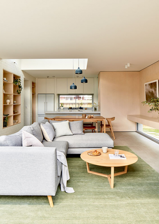
The owners of this Northcote, Victoria home weren’t after anything over the top in their recent renovation, but achieving their objectives on a relatively compact block (390 square metres) and budget required the expertise of Project 12 Architecture.
Rather than adding a mammoth extension, the practice devised a reworking of the original brick home, plus a modest 39 square metre addition containing new kitchen, dining, and living areas.
The existing house required significant refurbishment, including re-stumping, internal hard-plaster, and flooring throughout, but aesthetic alterations were minor. ‘The red brick, semi-detached residences [in the area] provide a utilitarian charm which was required to maintain and respect in our proposal,’ says Aimee Goodwin, director of Project 12 Architecture.
The most significant change made to the original house was repositioning the front door to the south, allowing space for a dedicated entrance hallway. ‘This space frees up the main living functions, liberating them from clutter and circulation,’ explains Aimee. ‘When entering, you immediately catch glimpses of the main living spaces through recycled brick piers and poplar ply shelves. You turn and your view is then taken out towards the end of the corridor to a light-filled, green courtyard.’
The extension meanwhile is a low-lying timber structure encompassing the new kitchen, dining area, and lounge room, with an adjoining north-facing terrace. Silvertop ash cladding on the facade is intended to silver over time to suit the native garden. ‘We wanted to ensure this project went beyond the typical open-plan extension. Expanses of glass and plasterboard are avoided,’ Aimee says.
Instead of the usual head-height windows, low-level window frames have been installed, offering views to low-lying native grasses and plants. This window position also mitigates hot afternoon sun, and provides privacy away from an adjacent property.
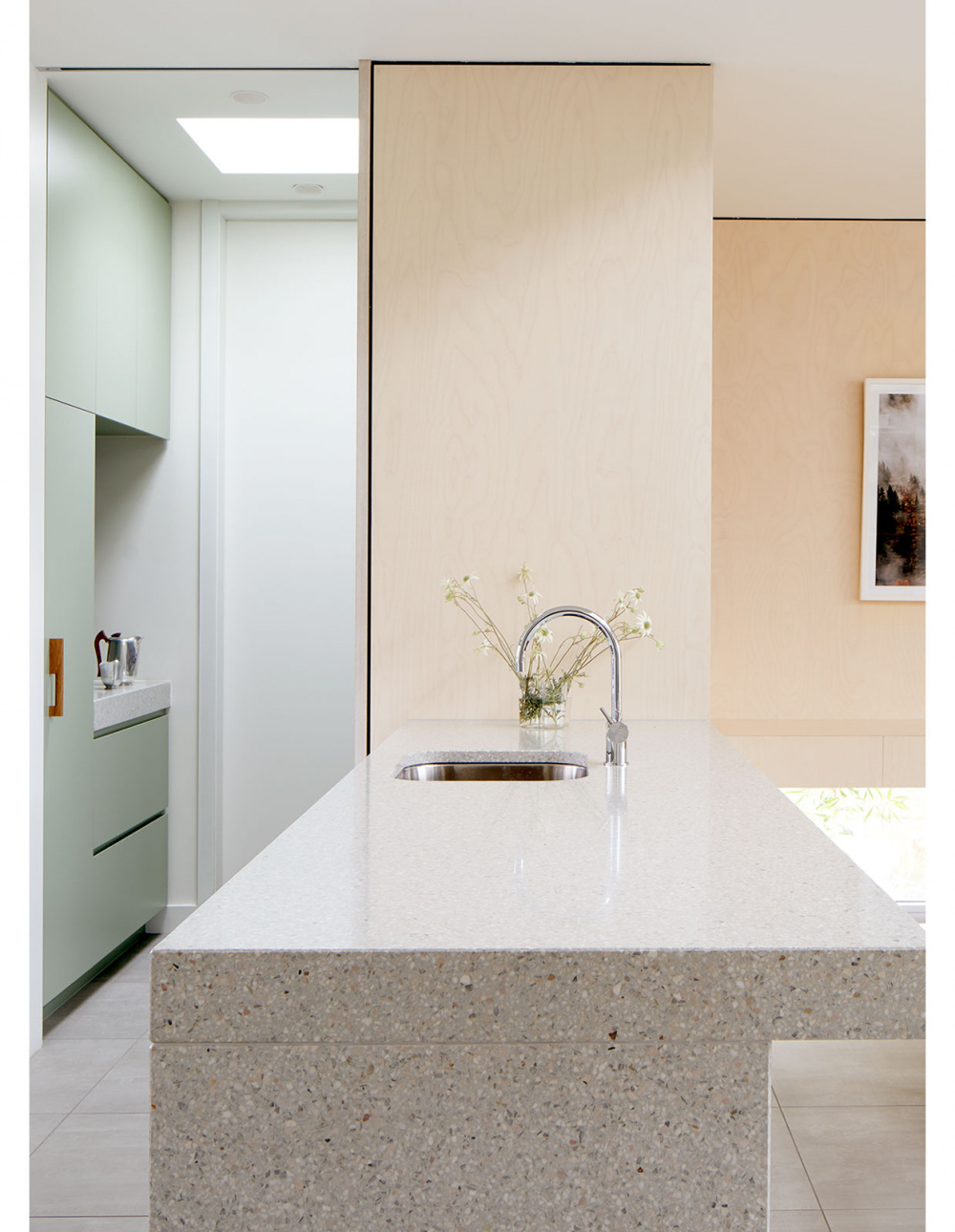
Poplar plywood walls and simple laminate kitchen joinery feature internally, elevated by terrazzo bench tops, and glimpses of sage green joinery from the utility room.
The final design meets the demands of the family’s everyday, along with an impressive 6.6 NatHERS star rating – well above 1.8 star state average!
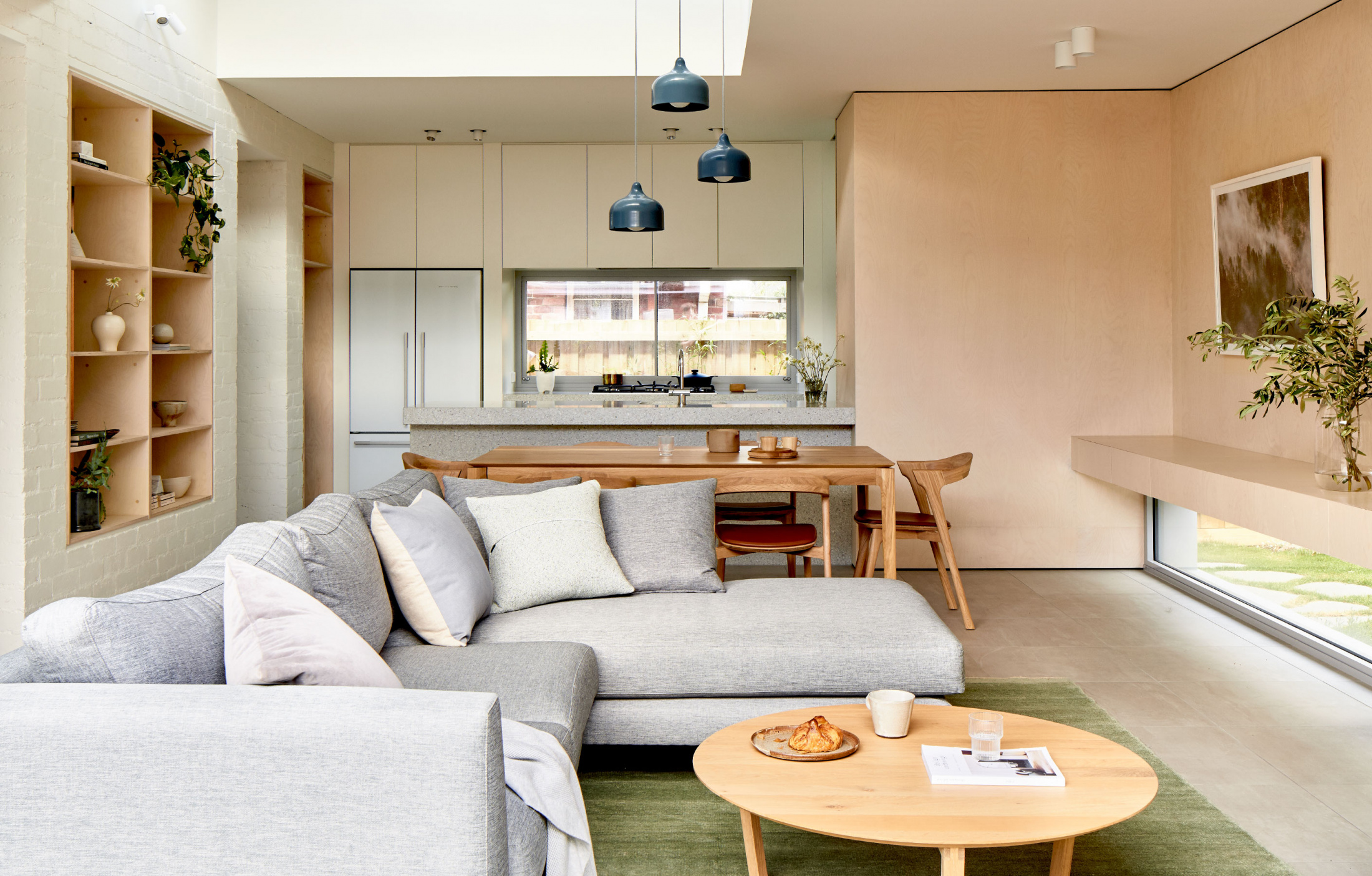
A renovation and modestly sized extension has transformed this Northcote home. Photo – Glenn Hester. Styling – Lauren Egan
Efficient planning provides three bedrooms, a study, bathroom, store room, all within a footprint of 146 square metres. Photo – Glenn Hester. Styling – Lauren Egan
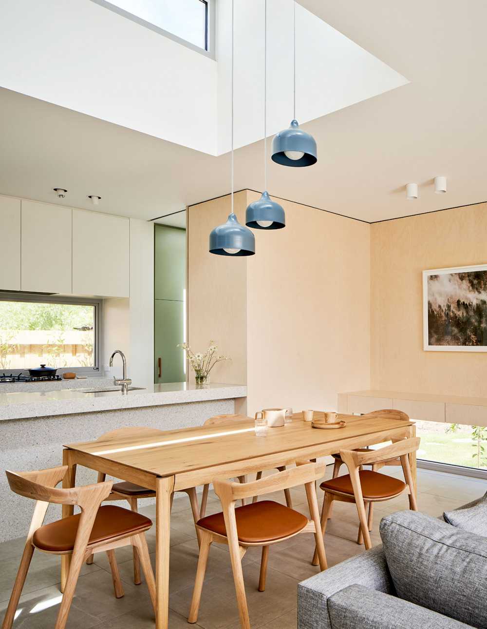
Poplar plywood walls and simple laminate joinery feature in the kitchen, elevated by terrazzo bench tops, and glimpses of sage green joinery from the utility room. Photo – Glenn Hester. Styling – Lauren Egan
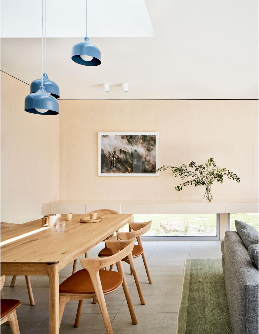
A high-level roof light allows penetration of morning light, and keeps hot air out. Photo – Glenn Hester. Styling – Lauren Egan
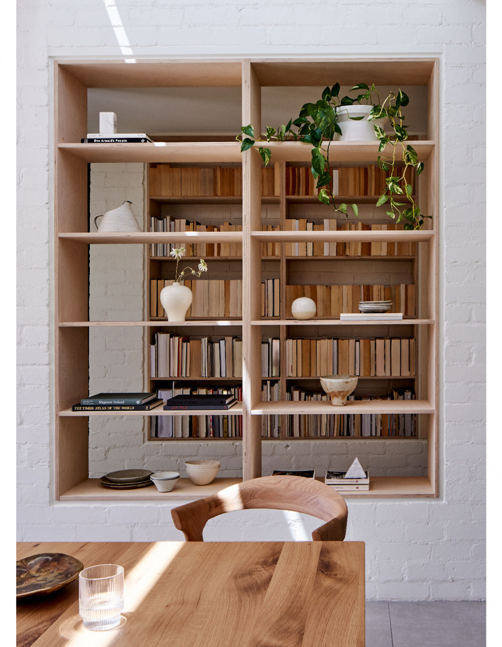
Recycled painted brick piers separate the old house from the new. Photo – Glenn Hester. Styling – Lauren Egan
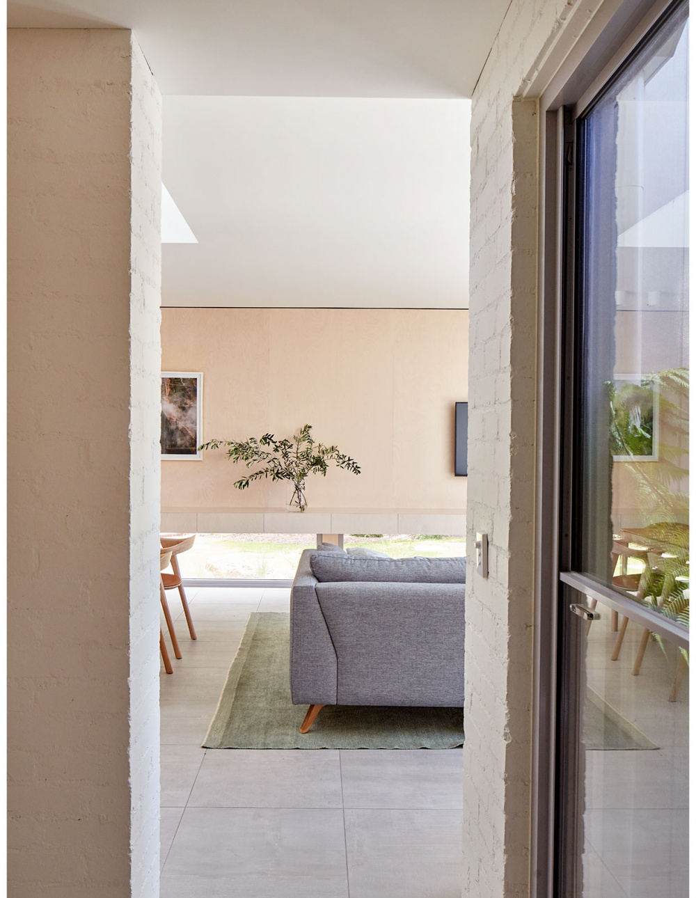
The design provides a home to entertain and be together, as well as places for solitude. Photo – Glenn Hester. Styling – Lauren Egan
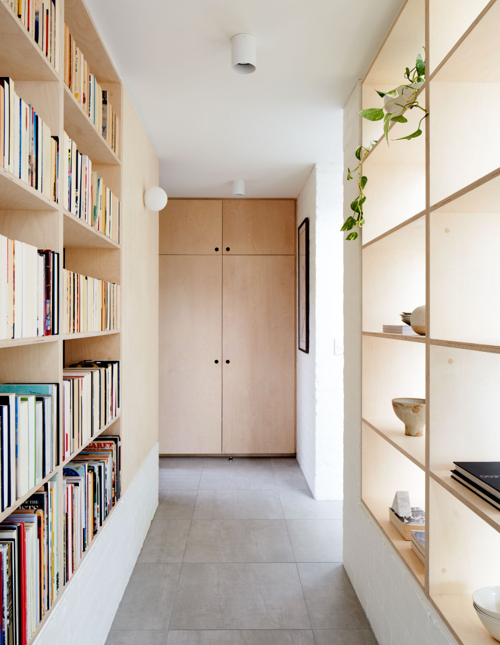
A dedicated entrance hallway frees up the main living functions, liberating the owners from clutter. Photo – Glenn Hester. Styling – Lauren Egan
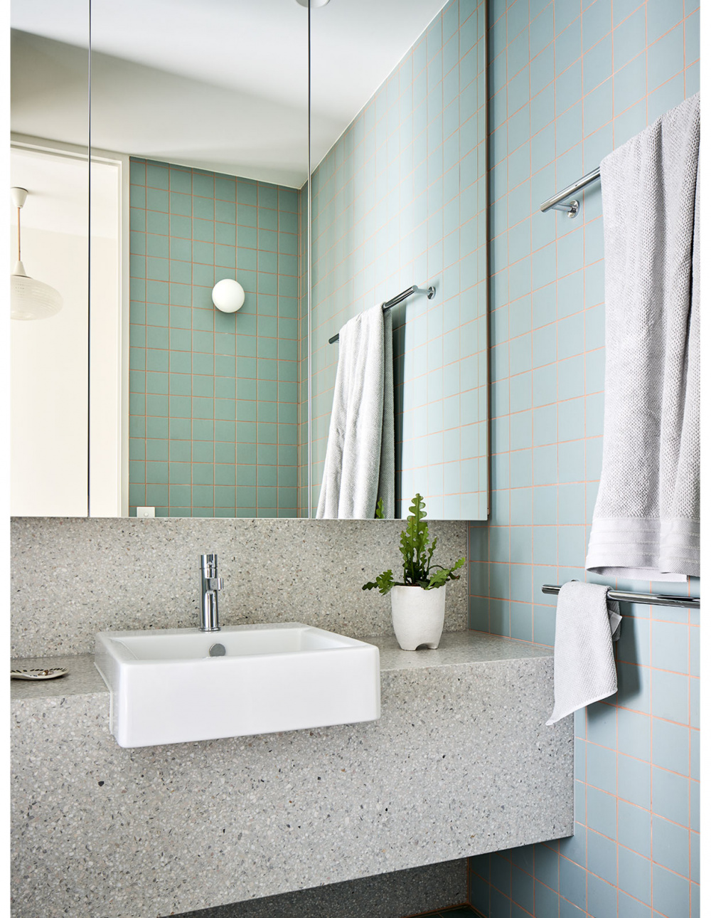
The footprint of the original front bedrooms and bathroom were predominantly maintained in their existing condition. Photo – Glenn Hester. Styling – Lauren Egan
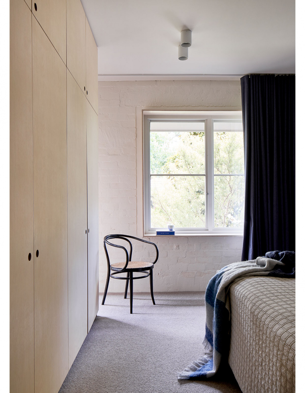
New flooring, carpet, double-glazed windows, plaster, and internal paint finishes were applied throughout the existing rooms. Photo – Glenn Hester. Styling – Lauren Egan
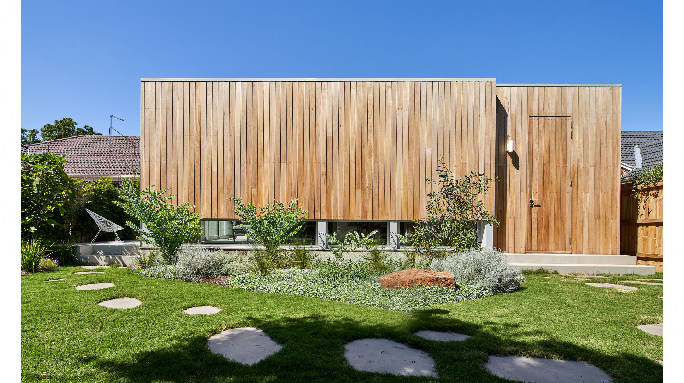
Silvertop ash cladding on the extension will silver over time to suit the native garden. Photo – Glenn Hester. Styling – Lauren Egan

Instead of the usual head-height windows, low-level window frames have been installed, offering views to low-lying native grasses and plants. Photo – Glenn Hester. Styling – Lauren Egan
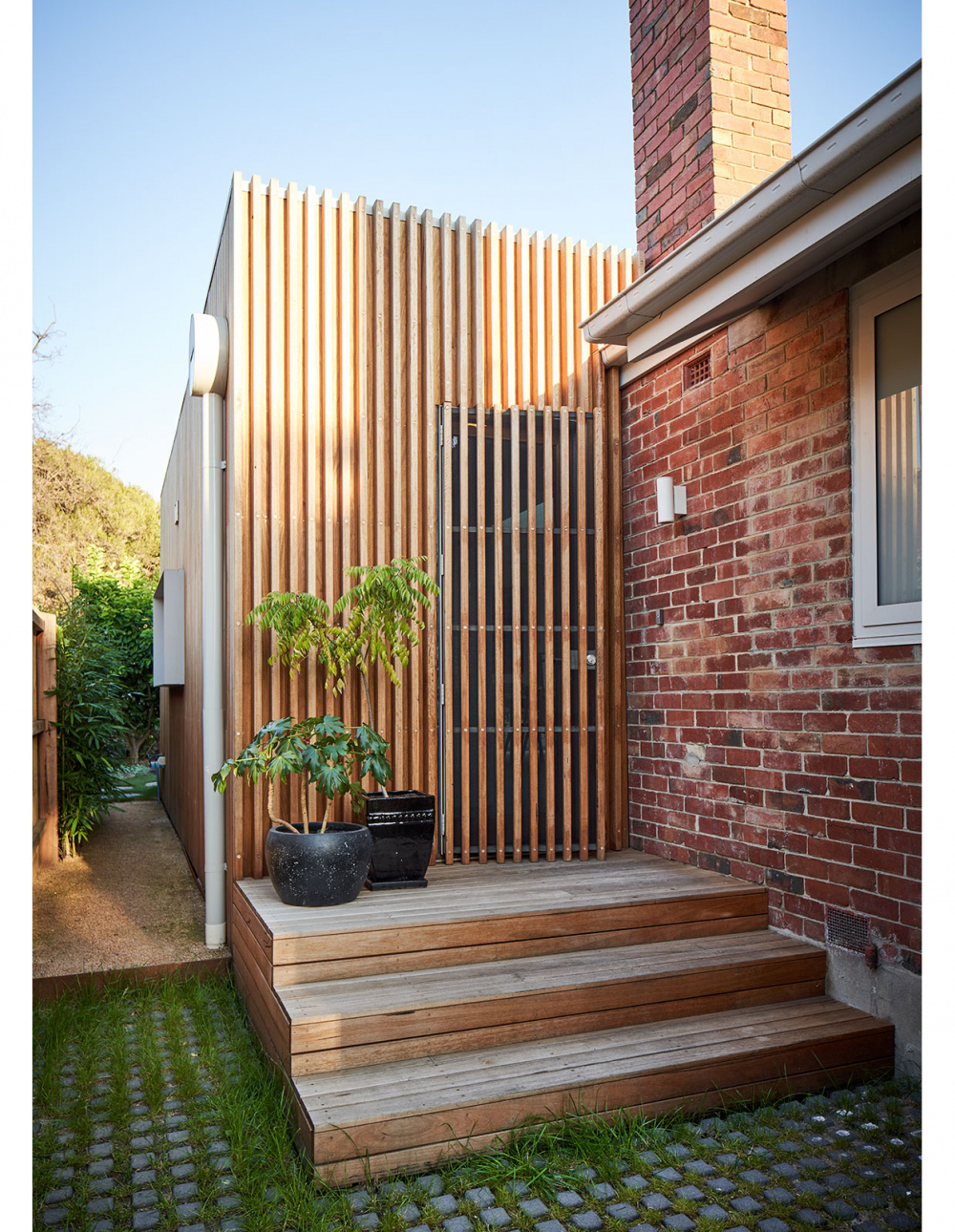
The front door was repositioned in the renovation, allowing space for a dedicated entrance hallway. Photo – Glenn Hester. Styling – Lauren Egan
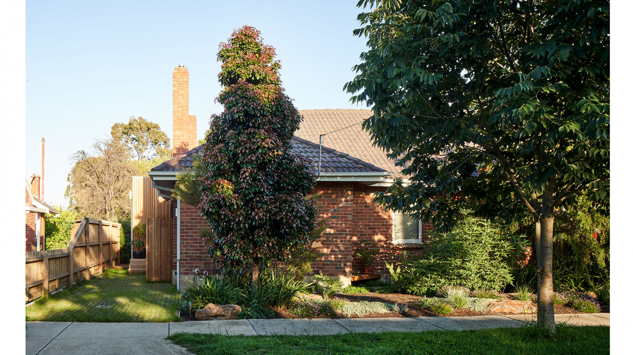
The low-lying extension sits to the rear of the existing house, peeking behind the existing brick volume, and setback from side boundaries to respect planning guidelines. Photo – Glenn Hester. Styling – Lauren Egan


